13.10.2021 - Photoshop
- Oct 21, 2021
- 3 min read
Updated: Sep 27, 2022
In this class, we were using the basics of photoshop that we had started the last lesson. Same as before since I know where my strong points are, I did my work on my iPad instead, using Procreate.
For the lesson, we were tasked with using the photo editing skills we’ve been taught to create a magazine cover for the well known digital media magazine, The Edge. As the example showed, we had to find character and background art and edit them together to make an aesthetically pleasing cover.
I started on ArtStation by searching for any random concept background that I liked the look of for inspiration. I found this concept sketch by “Avi.” of a sketchy fantasy-style drawing that seemed to be used for a platform game of some kind or was at least an environment that was open to exploring.


After finding this background that I liked the style of I went looking for a character with a similar art style so it would blend in well with the background. I found this character concept by “Cara Baxter” that I thought had a similar fantasy feel to the background. It also had two options of the fully coloured character or an earlier concept sketch. I took the earlier sketch and used that for the character on the cover.


After finding the title for the magazine I started the first step of making this cover. I put all the images together on the canvas, positioning them however I wanted, then started removing the background of the title and the character. For the character, there was a solid background colour behind it, so I was able to use the automatic selection tool to easily remove it.


The title for the magazine was black and blended into the background, while I wanted it to stand out, so I used the invert tool to invert the black to white. Now the title looked bolder and stood out.
Now I had all the images positioned how I wanted them I started improving the colours and blending everything together. Using a clipping mask over the character, since the background has an orange tint to the paper of the sketch, I added a translucent red layer over top of it then messed around with the blending modes until I was satisfied with the look.

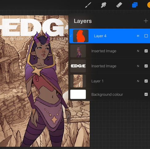


While at first, I was going to have the character have a sepia colour pallette like the background, I decided to instead change the background slightly to add some colour, making it look like a watercolour painting. I used similar colours to the character so they all looked cohesive together. To add to the watercolour look, using an artistic stylised brush on a very dark brown, I added a vignette to draw attention towards the centre of the cover and the character.

To finish off the cover, drawing more attention to the character, I added a glow around the edge using the direction of the light from the background to make the two images blend together well.
From the aesthetics of this cover, I’d think the game would be a platformer with a fantasy theme to it, probably more aimed at younger people as the style is much more simple then the usual realistic styles of games now.

Since I had some extra time in the class after finishing that cover I decided to do another in a more realistic style. I decided to choose a sc--fi theme and chose the first realistic style illustration I found, by "David Masson San Gabriel".

I looked around at a few backgrounds, trying to keep in mind the colours of the character and the realistic style so the two images together would look more cohesive once edited.


I settled with a very dark background of some sci-fi looking machinery by "Pablo Vinuesa", also considering that the mostly white and gold alien character would stand out well on the dark background. Since the background of the alien was such a similar colour to the body, using just an eraser pen, I slowly erased the background. I then placed all the images together how I wanted them.

I then moved on to colour correction, as the alien had much cooler lighting than the background. I used the "hue and saturation" option to make the image have warmer tones, matching closer to the background. Just as I had previously, I also used clipping masks and blending options to add lighting and shadows to the alien that made sense. I also added lighting to the background with a similar method, making the lighting look a lot more dramatic.

To finish off the cover, I also added a "perspective blur" to the bottom of the alien, to bring the attention up towards the bold title and the face of the alien.


Comments