First Concepts & Research
- Apr 30, 2023
- 5 min read
For the client-based work, the project we were given was to make an educational game for adolescence with diabetes. This game would help teach them how to manage their condition while still presenting it in a more fun and somewhat lighthearted way.
Within the team that was established for this project, being everyone in our class, I was given the role of concept artist which best fit my skills and work preferences.
Once we were given the desired concept for the project, the first work I did with the team was brainstorming ideas. Since everyone was considering going in one of two directions, a VR game or a mobile infinite runner, we all set out to do some research and find places of inspiration. Since my area of work was related to aesthetics and visuals of the game, that was primarily what I focused on.
I began with research for the infinite runner option. Starting out, I first did a quick sketch to better visualise the idea and genre of the game.

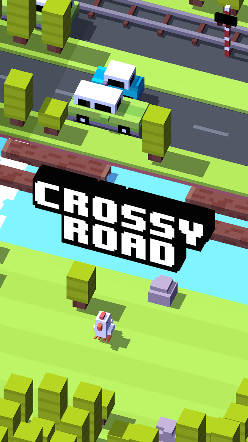
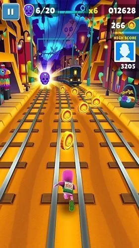
While doing this sketch, I looked at the most popular runner games that are currently available on most mobile stores: Crossy Road, Subway Surfers and Temple Run.


While all of these games have very different styles, they all have elements of good design to use as inspiration.
Beginning with Temple Run, as it was the one I took the least inspiration from due to its aesthetics. The visuals of these games are very "old school", being pixilated somewhat and low poly. While this could be a good style to consider to make creating models easier the way it is presented in this game doesn't seem as child friendly or appealing to the target audience we intend this project to be for. However, this game is still very successful and has fun addicting gameplay and so features of it may be good to consider, including challenges along the way that switches up the gameplay to keep it interesting. This includes obstacles that the player needs to jump over or duck under as well as enemies to avoid.
Subway Surfers has similar features to Temple Run, then also adds onto it with power-ups and a highly customisable character. I believe both these features are also good ones to consider, as power-ups give a sense of reward to the player, making gameplay satisfying. Customising the avatar also helps the player see themselves more in the character they are playing, which I believe is a useful feature to have considering our game is meant to be teaching kids to look after themselves. Having all kinds of young people represented in the games visuals can help them relate to and remember all they may learn from the app.
The aesthetics of Subway Surfer I believe are also a good style to consider for our game as the game has quite a cartoonish and child-like feel. Its models are somewhat similar to media that already exists and is very popular with our demographic such as Disney animations.
Finally, I looked at Crossy Road, which I think is a good balance of the two previous games. While the visuals are low poly and very simple shapes, the texturing and colours of everything are also very bright and childlike. This style of game makes asset creation much easier on the creators of the models while still having a distinct aesthetic.
Moving on to the VR concept, I also did a sketch for this concept.

I couldn't find many games similar in design to the concept that I believed would be useful, besides the very popular VR game Beat Saber.

Beat Saber is a rhythm game where you have to hit blocks in a certain way in time to the beat or rhythm of a song while also avoiding obstacles. Just like in my previous examples, I believe including some kind of extra obstacle within the game will keep gameplay interesting and engaging, in this case also encouraging the players to move their bodies in response to the game and be more active which goes well with the educational and health based concept.
Looking at the visuals of this game, while I don't believe I'll be taking direct inspiration from the sci-fi aesthetics of the neon environments of this game, I still think the layout of the levels is interesting to draw from as the levels still look interesting without distracting the player from the gameplay too much or obscuring their view of anything needed for gameplay.
As well as looking at all these very popular games for inspiration, I also looked at games that are targeted at young children with a similar educational theme to see what kind of visuals they may be used within this very particular market of gaming.
I discovered this website and then looked at the games mentioned within it: https://www.commonsensemedia.org/lists/best-health-apps-and-games-for-kids
A majority of these games were teaching young children how to have a balanced diet and eat healthily, which is the closest topic I could find to the game we will be creating. I could not find any other game featuring the subject specifically of diabetes.
The three games I looked at in particular were Pick Your Plate, My Food and Color Quest AR.
Pick Your Plate has the player planning their meals while also having facts about certain ingredients, dishes, or locations around the world dishes originate from. The colour palette of this game is mostly very soft but colourful including mostly pastel shades. The style is also cartoonish with colour blocking with very simple shapes.

My Food has almost the same concept and gameplay as Pick Your Plate, however, it's style looks more drawn almost as if a child has drawn parts of it with characters that look like childish caricatures. The colour palette is also much brighter and bolder.

I've included Colour Quest AR due to its interactive and AR features, as it closely aligns with our VR game concepts. Similar to My Food, its colours are very bold and bright and there doesn't seem to be any particular colour palette. The characters of this game are anthropomorphic fruit, vegetables, or even body parts. It mixes a cartoonish style with realistic features. While this game has plenty of different minigames within it, keeping the gameplay interesting, visually I enjoyed this game the least as it seems somewhat chaotic in its visual. It doesn't stick to one style, and the models seem somewhat outdated (and terrifying in their faces honestly).

From looking at all of these games and taking inspiration from them, I decided that there were two ways that visually our project could go while keeping to the demographic we were given.
The first option was a semi-realistic yet cartoonish style, with bolder colours. This would be similar to Subway Surfers, Disney and other media that primarily are within the same demographic.
The second I called the "toy" style, as its visuals were far more simple shapes and had slightly softer colours, stepping further into the cartoon elements of the style.
For both of these styles, I made mood boards to show the rest of the team these two options in a way that was easier to understand than my explanations.


From these mood boards I then also created a comparison of styles which I was capable of drawing and could be options for the game. Alongside my drawings, I included notes of the benefits/ drawbacks of the style as well as inspirational images.


Comments